Koprabuh
Koperasi Produsen Anugerah Bumi Hijau
The Green Earth Grace Producers Cooperative: landowners, Indigenous communities and farmers who bring their land into the work.
Brand identity · v1.0 · 2026
Koprabuh Gracia Carbon works where green land meets low-carbon energy. This page sets out the identity behind it: one symbol built from the letters K, G and C, two gradients from leaf to ocean, one typeface, and a few clear rules for using them.
01 — About
Some say green companies are the answer. We exist to meet the demand for low-carbon energy — through greening, services and environmentally friendly products, and renewable technology.
Planting and restoring land so it can store carbon again — together with the people who own and work it.
Environmentally friendly products and services that lower the footprint of the businesses that use them.
Energy from sources that grow back, built to respond to energy scarcity and a warming climate.
02 — The name
Each word in the name gives the symbol one of its letters — and one of its ideas.
Koperasi Produsen Anugerah Bumi Hijau
The Green Earth Grace Producers Cooperative: landowners, Indigenous communities and farmers who bring their land into the work.
Latin: blessed, kind · Spanish: graceful
Grace in nature and in character: lush, cool plants, and a gift to nature and humanity.
the element of life
The work itself: reducing CO₂ emissions to make life on the planet better.
03 — The mark
The three initials are integrated to stand for complete service and products. Hover or tap each part to find it in the mark.
K + G + C = KGC. A fair cooperative, a gift of nature and carbon held in balance — growing a better life.
04 — Construction
The symbol is drawn on a grid of equal squares. One square is the module, u; the symbol stands exactly 12 u tall. Toggle the layers to read the parts and their sizes.
| Element | Size |
|---|---|
| Module — one grid square | 1 u |
| Symbol height | 12 u |
| Symbol width | 16.6 u |
| K, width | 3.6 u |
| G, width | 10.5 u |
| C, width × height | 11.2 × 11.4 u |
| Seedling, width × height | 7.0 × 5.4 u |
| Stacked logo: symbol ↔ wordmark | 3.5 u |
| Stacked logo: wordmark width | 27.4 u |
Measured from the master vector files. u = one twelfth of the symbol height.
05 — Colour
Two greens for growing things, two blues for depth and trust. Used together they form the gradients in the symbol. Click any swatch to copy its code.
Always run them light to dark, in the direction shown.
Derived from the core palette so text stays readable.
Lime and Leaf Green are too light for text on white. Use them for shapes and the symbol, and switch to Forest for green text.
06 — Typography
Cabin is a humanist sans with a warm, slightly rounded italic — the same voice as the wordmark. Use the italic for headings, the upright for reading.
KOPRABUH GRACIA CARBON, set in heavy italic capitals on two lines and filled with the blue-to-green gradient. It is outlined artwork — never retype it.
Aa
Green land, clean energy.
ABCDEFGHIJKLMNOPQRSTUVWXYZ
abcdefghijklmnopqrstuvwxyz 0123456789
Aa
Every planted hectare stores carbon, supports a family and protects the land for the next generation.
ABCDEFGHIJKLMNOPQRSTUVWXYZ
abcdefghijklmnopqrstuvwxyz 0123456789
Regular, Medium, SemiBold and Bold, each with an italic.
07 — Usage
Choose the version that gives the clearest contrast. Always start from the master files below — never redraw or retype the logo.
Keep at least 2u — one sixth of the symbol's height — free on every side of the logo.
Wide logo: 140 px or 35 mm wide. Symbol alone: 24 px or 6 mm. Smaller than that, use the symbol without the words.
08 — Imagery
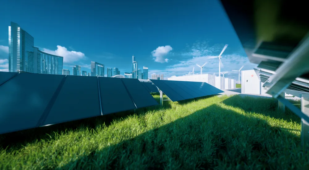
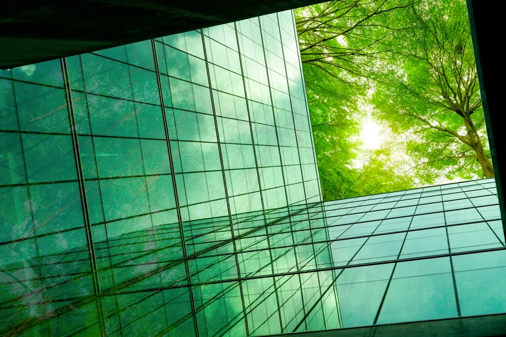
Photography shows clean technology living alongside nature: bright daylight, deep greens, open sky. Never smoke, bare land or grey industry.
09 — Applications
From a letterhead to a billboard, the same symbol, gradients and type hold everything together. Select any image to view it larger.